Uniform Colours and Brand Psychology: What Actually Works in the UAE
- Topic
- Uniform Sourcing
- Written
- Read
- 9 min read

Key Takeaways
- Uniform colour nudges first impressions a little, not a lot. Heat, laundry and visibility decide whether a colour actually works.
- Research links blue with competence, red with excitement and white with sincerity. It studied brand logos and products, not staff uniforms.
- In the UAE, pick by role first and brand second. A chef, a guard and a receptionist don’t need the same shade.
- Dark fabric absorbs more sunlight, but fit and airflow matter as much as the colour. Test it on a real sample.
- Two colours is a safe limit: one base and one accent.
- Approve a physical swatch, and record the dye lot and thread codes so reorders match.
Uniform colour psychology is the idea that the colour your staff wear changes how customers feel about your brand. It’s partly true, and it’s often oversold.
Here’s the honest version. Colour does shape first impressions. A receptionist in crisp white and one in muddy olive get read differently before either says a word. But the research behind “blue means trust” is about logos and packaging. It doesn’t promise anything about a polo shirt on a hot Dubai afternoon. If you’re choosing uniform colours for a UAE team, psychology is the first question to ask. It isn’t the last.
What does colour psychology say about uniform colours?
Studies on brand colour link blue with competence, red with excitement, white with sincerity and brown with ruggedness. But those studies looked at brand logos and products, not staff uniforms, so treat them as a nudge to first impressions, not a rule. Role, climate and cleanliness usually matter more than the shade.
The best-known source is Labrecque and Milne’s 2012 paper in the Journal of the Academy of Marketing Science. They mapped ten colours onto brand personality traits, and also tested how saturation and lightness change the effect. A stronger, more saturated shade pushes the same trait harder.
Not sure which uniform colour suits your team?
Share your logo and brand colours and we’ll show you how they look across the garments you’re considering.
That last part matters for uniforms. “Blue” isn’t one thing. A deep navy and a bright royal blue send different signals, and a faded one sends a third. In a customer base as mixed as the UAE’s, I wouldn’t build a uniform around one colour meaning. Use it as a tiebreaker, not a strategy.
Which uniform colours suit which UAE industries?
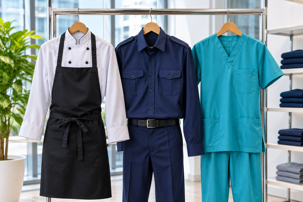
Match colour to the job before the brand. Navy and charcoal suit security and corporate roles, white suits kitchens and clinics where cleanliness must show, soft blues and greens suit healthcare, and lighter shades suit outdoor crews. These are common industry patterns, not rules, so test any choice on a sample.
| Setting | Colours often used | Why it tends to work | Watch out for |
| Hotels and resorts | White, black, navy, one brand accent | Reads clean and formal, and mixes well across departments | White shows sweat and stains, black shows lint |
| Restaurants and cafés | Black, charcoal, white, branded apron | Dark hides spills, white signals hygiene | Black gets hot near a kitchen line |
| Healthcare | Soft blue, teal, green, white | Calm tones, and colour-coding by role helps patients tell staff apart | The system only works if every reorder matches |
| Security | Navy, black, dark grey | Looks authoritative and hides marks | Heat outdoors, and visibility at night |
| Offices and corporate | Navy, grey, brand colour as accent | Reads calm and competent | A full shirt in a bright brand colour can look loud |
| Outdoor and industrial crews | Light grey, light blue, hi-vis | Lighter shades absorb less sun | Hi-vis shades are set by the standard (EN ISO 20471), so brand colour goes on trim and logo |
If you’re choosing one of these, it helps to see the colours on real cuts. Browse UC Uniform’s hotel uniforms, medical uniforms and security uniforms to compare how the same colour looks across garments.
Does a dark uniform colour make staff hotter?
Dark fabric absorbs more sunlight than light fabric, but absorption isn’t the same as heat reaching your skin. A 1980 Nature study found a loose black robe and a white robe gave the same heat gain in the desert. Fitted polos behave differently, so test your fabric and fit.
That study, Shkolnik and colleagues in Nature, found that the extra heat the black robe absorbed was lost before it reached the wearer’s skin. The robes were loose and flowing, which let air move. A close-fitting polo doesn’t have that airflow, so I wouldn’t assume the result carries over to a typical uniform.
My practical rule: if the team works outdoors in direct sun, go lighter or choose a lighter fabric weight. If they’re mostly indoors in air-conditioning, a dark shade is fine. We covered the fabric side in more detail in our guide to the best uniform fabric for Dubai heat.
How do you keep uniform colour consistent across reorders?
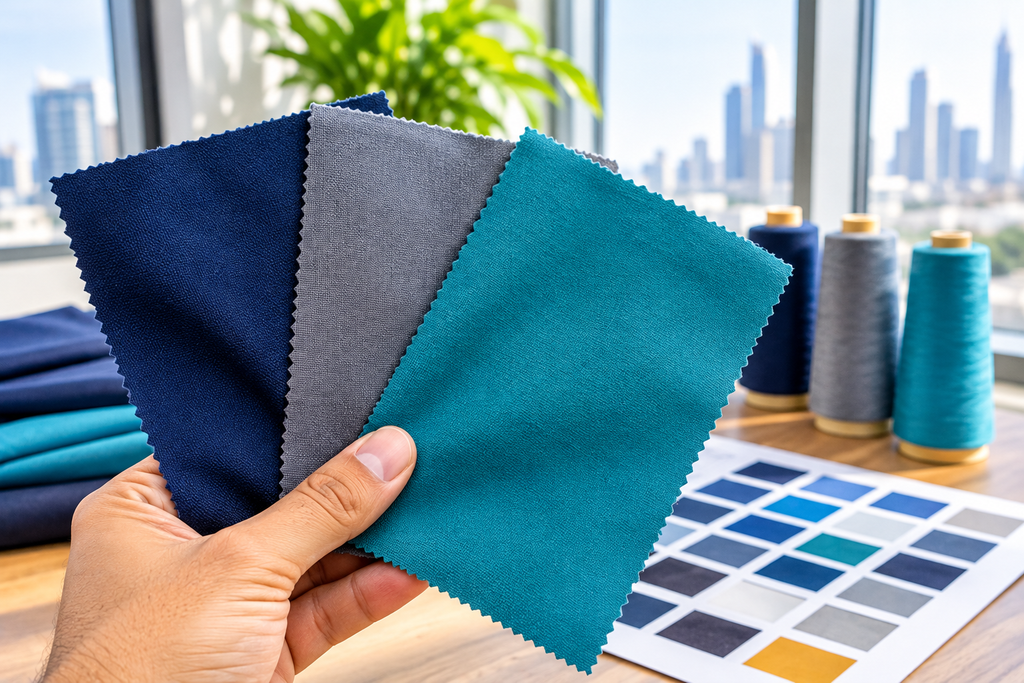
Record the Pantone reference, fabric dye lot and thread codes, and approve a physical swatch in daylight before bulk production. Dye lots can drift between batches, and screens never show fabric colour exactly. Keep one signed swatch on file so any reorder can be matched to it.
This is where many uniform programmes quietly go wrong. The first order looks right, then a reorder arrives six months later in a slightly different navy, and now half the team looks mismatched.
Thread colour is its own match, separate from fabric colour. That’s why logo embroidery should get its own approval step, not just a nod at the fabric sample.
How do you choose uniform colours, step by step?
Start from the job, then the brand, then the test. Five steps cover it:
- List the roles and where each person works. Indoors in air-conditioning, outdoors, near a kitchen, customer-facing or back of house. Each setting pulls the colour choice in a different direction.
- Start from your brand palette. Pick one base colour and one accent. Often the base is a neutral such as navy, charcoal or white, and the brand colour lives in the logo, trim, tie or apron.
- Check swatches in daylight and in your own office lighting. Hold them next to a few team members too. The same colour looks different on different people.
- Wash and sun-test a swatch. A week of strong sun and a few hot washes tells you more than any colour card.
- Approve a physical sample in writing. Then record the Pantone reference, dye lot and thread codes.
Five common mistakes
Is your brand colour automatically your uniform colour?
No. A bright brand colour across a whole shirt can look loud, show sweat and fade faster. Use it where it earns its place: the logo, trim, tie or apron.
Does black look premium everywhere?
It looks sharp indoors, but it shows lint, goes grey as it fades, and runs hot outdoors. Premium comes more from fit, fabric and a clean finish than from the colour.
Are light colours always cooler?
Not always. The Nature study above is the reason to be careful with absolute claims. For close-fitting uniforms in direct sun, lighter shades are usually the safer choice, but fabric and fit matter as much.
Should every role wear the same colour?
Not necessarily. Many teams keep one base colour and change the accent by role. That keeps the brand consistent and still lets people tell roles apart.
Is colour psychology settled science?
No. It’s a set of tendencies, mostly from studies of logos and packaging. Use it to rule out bad ideas, not to promise results.
One colour or colour-coded by role?
Both work, and they fail in different ways.
| One colour for everyone | Colour-coded by role | |
| Pros | Strong, consistent identity. Simpler reorders. | Customers and colleagues can tell roles apart at a glance. |
| Cons | Roles blur. One fabric rarely suits both a kitchen and a front desk. | More colours to order and match. Consistency is harder across reorders. |
| Better when | You have a small team, or similar roles. | You have distinct departments, or guests need to find the right person fast. |
When a custom colour isn’t the right call
A custom colour makes sense when your brand colour matters and the volume justifies it. It doesn’t make sense if you need uniforms quickly, or you’re kitting out a very small team. In that case, a ready-stock supplier with navy, white or black polos is usually faster, and we’d rather say so than sell you a custom dye you don’t need.
Also consider this: if your brand colour is a bright or unusual shade, a neutral uniform with brand-colour embroidery is often easier to reorder and match than a whole garment dyed to that shade.
Uniform colour at a glance
| Item | Detail |
| Colour and brand personality | Labrecque and Milne (2012): blue linked with competence, red with excitement, white with sincerity, brown with ruggedness. Studied brand logos and products, not uniforms. |
| Dark vs light robes in desert heat | Same heat gain for the wearer in a loose robe (Shkolnik et al., Nature, 1980) |
| Safe colour limit for one uniform | 2 (one base, one accent) |
| Records to keep for matching reorders | Pantone reference, dye lot, thread codes |
FAQs
What is the best uniform colour for a company?
There is no single best colour. Navy suits most offices, hotels and security teams because it looks smart and hides marks, while white suits kitchens and clinics where visible cleanliness matters. Choose by role, climate and brand palette, then test a real sample in daylight before ordering.
Does uniform colour psychology really work?
Partly. Research links blue with competence, red with excitement and white with sincerity, but those studies looked at brand logos and products, not staff uniforms. Treat colour as a nudge to first impressions, not a sales tool. Fit, cleanliness and service matter far more than the shade.
What uniform colours are best for hot weather in the UAE?
Lighter shades absorb less sunlight, so white, sky blue and light grey suit outdoor roles best. If your brand colour is dark, offset it with a lighter fabric weight, an open knit or a lighter shirt with dark trousers. Fit and airflow also matter as much as the colour itself.
How many colours should a company uniform use?
Two is a safe limit: one main colour for the garment and one accent in the logo, trim, tie or apron. Three or more starts to look busy and makes reorders harder to match. Role colour-coding can use a different accent per team while keeping one base colour.
Can my uniform match my logo colours exactly?
Usually close, but not exact. Fabric dye, thread and screen colours are all different media, so a logo can shift slightly between them. Send a Pantone reference, approve a physical swatch and sample in daylight, and ask your supplier to record the dye lot and thread codes for reorders.